
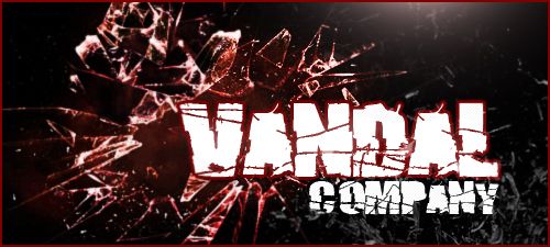
SIMPLE. That is the word I will use for this Banner I have created for you. I lowered the height of the banner because it just looked like a box. I don't like boxes when I make my designs.
You did not provide a "focal" image, so in this... the Text is the focal point. I stuck with the theme we discussed, and it turned out decent. It's not as "flashy" as my sigs, but it is always harder to make just plan text and broken glass pop more. Hope you like it.
HTML Code:[img]http://i18.photobucket.com/albums/b125/Razgriz1988/VandalCOBanner.jpg[/img]
All times are GMT -4. The time now is 09:06 PM.
Results 1 to 3 of 3
Thread: Specact/Vandal CO. Pick-UP
-
05-03-2013, 10:50 AM #1FC Founder

Owner of Vader Visuals
- Join Date
- Jun 2006
- Location
- Lehigh Valley, PA
- Posts
- 2,875
- Blog Posts
- 7


Specact/Vandal CO. Pick-UP


-
05-03-2013, 10:51 AM #2Fabled Legendary Member
I Like Turtles!
I Live in an Igloo!
- Join Date
- Apr 2011
- Location
- Ontario, Canada
- Posts
- 2,963
- Blog Posts
- 4


Re: Specact/Vandal CO. Pick-UP
I think this looks epic!
Nice job RaZ."Do you guys know how hard it is to masturbate with you all talking!" - UNLUCKY

Former Field Marshal of both the REDD and BLUE
Creator of 21st Degree and the Resistance
7 victories fought and lead
-
05-03-2013, 11:35 AM #3Senior Member

- Join Date
- Jul 2011
- Posts
- 108
Re: Specact/Vandal CO. Pick-UP
I agree with Fuzzy! Epic indeed! Thanks for making this for Vandal.

 Reply With Quote

Thread Information
Users Browsing this Thread
There are currently 1 users browsing this thread. (0 members and 1 guests)


FC Media Links